Anti-Drug Campaign
Young adults and community members who struggle with drug addiction
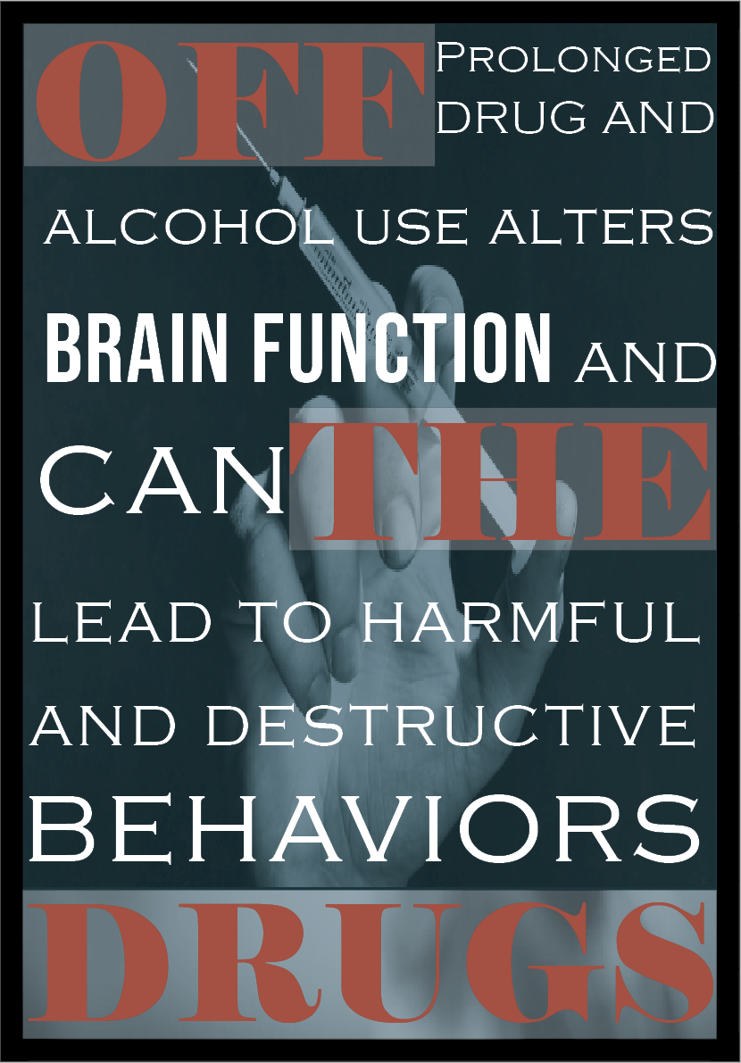
Communicate the risks and long-term consequences of drug use without relying on fear tactics alone. The design needed to balance emotional weight with clarity so the message would resonate instead of being ignored. Another challenege was also making the design mainly focusing on the typography
For this piece, I chose to let typography carry the weight of the message. Instead of relying heavily on imagery, I focused on emphasizing key words to immediately draw the viewer’s attention to the most important parts of the statement. By varying scale, weight, and placement, I created a visual hierarchy that guides the reader through the message in a deliberate way. The goal was to make the impact feel direct and unavoidable. I wanted certain words to stand out almost as warnings, while the surrounding text supports the overall tone. The design remains minimal so the message doesn’t compete with unnecessary elements. Every typographic decision was made to strengthen clarity, urgency, and emotional emphasis.